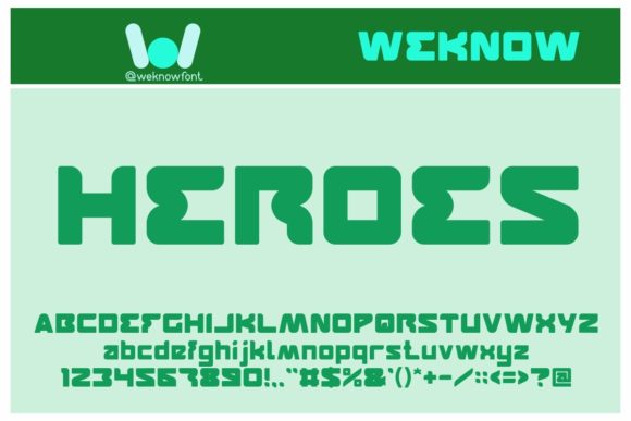
Features Font: A Techno Display Typeface for Digital Impact
As a UI designer who ships landing pages, SaaS dashboards, and conversion-optimized e-commerce experiences, I reach for display fonts not just for flair—but for function. Features Font stands out precisely because it delivers both: a sharp, techno-inspired aesthetic that communicates innovation without sacrificing clarity in digital contexts.
Visually, Features Font leans into clean geometry with subtle digital edge—think precise terminals, balanced negative space, and consistent stroke contrast. It’s not retro-futuristic or overly mechanical; instead, it feels purpose-built for interfaces where modernity and legibility coexist. The letterforms hold structure at small sizes (down to 24px on high-DPI screens), and the uppercase-heavy rhythm works especially well for short, high-impact text: headlines, section dividers, CTA buttons, and brand lockups.
Where Features Font Earns Its Place in Web Layouts
In real-world web design, Features Font thrives where attention must be directed—not diluted. On a product landing page, it anchors the hero headline above a clean value proposition, reinforcing technical credibility before users scroll. In an online store banner, it elevates limited-time offers (“LAUNCH WEEK”) without competing with product imagery. For coaching or course sites, it adds distinction to module titles or certification badges—hinting at precision, structure, and forward-thinking methodology.
It’s also highly effective in portfolio websites and creative agency showcases. Pair it with a neutral sans serif like Inter or Manrope for body copy, and you instantly establish visual hierarchy: Features Font declares intent; the supporting type delivers substance. On dark-mode interfaces, its crisp outlines pop against charcoal or navy backgrounds—especially when set with modest letter-spacing (0.5–1.2px) and line-height between 1.1 and 1.3.
Readability & Responsiveness: Practical Considerations
While Features Font is designed as a display font, its digital performance depends on thoughtful implementation. It’s not ideal for long paragraphs, navigation menus, or mobile body text—but it excels in controlled, high-signal zones. On mobile, use it only for primary headers (H1) or prominent CTAs, always testing at 320px viewport width. Avoid stacking multiple weights in one layout; stick to one bold weight for impact and pair it with a single, highly readable body font.
For image overlays—like hero banners with gradient masks or semi-transparent backgrounds—ensure at least 60% contrast between text and backdrop. A light-weight variant (if included) may work for subtle subheads, but most designers find the standard bold weight most reliable across devices. Always serve webfont files in WOFF2 format for optimal load speed and include fallbacks in your CSS stack.
Smart Pairing for Brand-Consistent Digital Experiences
Font pairing isn’t decorative—it’s strategic. Features Font pairs best with humanist sans serifs (e.g., Lato, Poppins, or IBM Plex Sans) for digital products requiring approachability and scalability. For editorial or premium brand sites—say, a boutique design studio or sustainable fashion shop—a restrained serif like Cormorant Garamond or Playfair Display can add sophistication while letting Features Font handle energetic accents.
Avoid pairing it with other display or script fonts. Its personality is distinct enough to carry visual weight on its own. Instead, let it shine in isolation: a logo wordmark, a testimonial quote header, or a feature icon label (“SECURE • FAST • SCALABLE”). That restraint builds trust—users sense intentionality, not clutter.
Licensing, Formats, and Real-World Use Cases
Features Font is distributed as a commercial font, meaning proper licensing is essential for client-facing projects, SaaS platforms, online stores, and downloadable digital templates. Most licenses cover web embedding via @font-face, desktop use in Figma or Adobe apps, and export to PNG/SVG for social media graphics—but always verify usage rights for app bundling or white-labeled dashboards.
Check what’s included: Does the package offer OpenType features like stylistic alternates or case-sensitive forms? Are there true italics or just slanted versions? Multilingual support (Latin Extended-A, basic Cyrillic) matters if your audience spans EU or LATAM markets. And while many display fonts skimp on weights, even one bold variant of Features Font is enough to drive hierarchy—no need for ultra-light or black extremes.
When to Reach for Features Font—And When to Hold Back
Use Features Font when your goal is to signal innovation, precision, or digital fluency. It fits naturally in tech startup landing pages, developer tool documentation headers, hardware brand identity systems, and digital course sales funnels where tone reinforces trust in execution.
Hold back when warmth, tradition, or handwritten intimacy is required—this isn’t a script or serif font. Skip it for restaurant websites, wellness blogs, or nonprofit storytelling where softness and empathy lead. Likewise, avoid it in dense data tables, form labels, or accessibility-critical UI elements where WCAG-compliant contrast and character recognition are non-negotiable.
Ultimately, Features Font earns its place not by being everywhere—but by being unforgettable where it counts. It’s a deliberate choice for designers who treat typography as infrastructure: part of the experience architecture, not just decoration. Whether you’re refining a checkout flow, launching a new dashboard, or building a brand kit for a B2B platform, this display font delivers clarity, cohesion, and quiet confidence—exactly what modern digital identity demands.